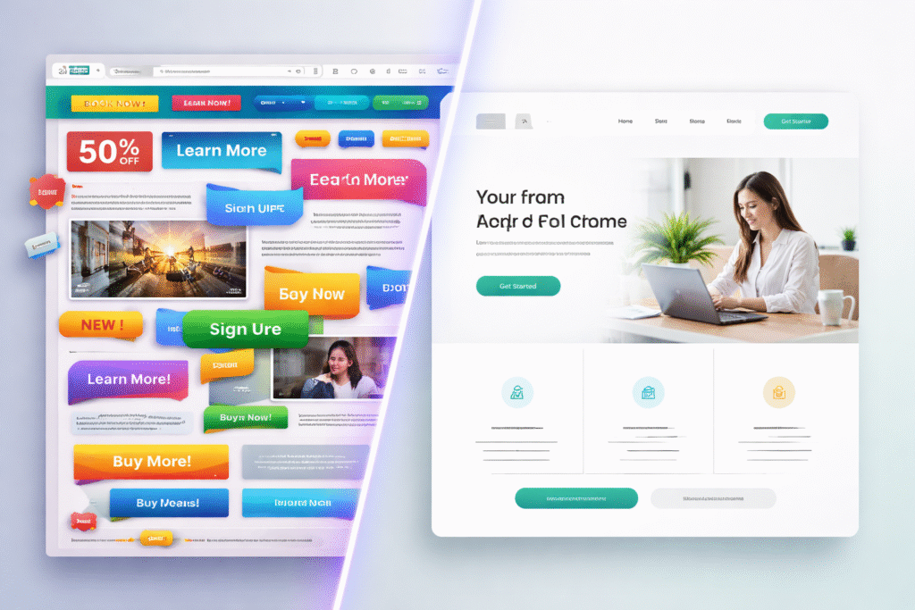
Web users in India scroll fast. They judge fast. If a site feels cluttered, most people bounce without a second thought. This shift pushed clean UI design into the spotlight. Clean layouts help users focus, understand content, and take action without stress. Many designers say it feels like giving users breathing room.
Indian audiences access sites mostly on mobile. Screens stay small, attention stays shorter, and clarity becomes a big deal. Modern website design now depends less on decoration and more on structure. Clean UI supports trust, speed, and comfort. It removes noise and keeps the message clear.
Businesses notice this change. Websites with clean user interface patterns see better engagement and smoother journeys. It feels natural, not forced. No extra fluff. Just what users need, right where they expect it.
What clean UI design really means for websites now
Clean UI design means showing only what matters. It focuses on spacing, readable text, calm colors, and clear structure. Many people mix it up with empty layouts, but that’s not true. Clean UI stays functional and helpful.
A clean user interface removes visual distractions and helps users scan pages easily. Buttons stand out. Text feels readable. Sections stay organised. Users don’t feel lost or overwhelmed.
This style works well for UI design trends shaping modern platforms. Indian startups and service sites use it to explain ideas faster. Designers often say it keeps the site honest and easy on the eyes.
How modern users react to clean website interfaces

Users trust websites that feel simple. Clean layouts signal reliability and clarity. When pages look organised, people stay longer.
A minimal UI design helps users find answers without effort. They don’t need to hunt for buttons or links. Everything feels placed with intent.
Indian users, especially mobile-first audiences, prefer this calm approach. It reduces mental load. Many users say it feels smooth and stress-free. That comfort pushes repeat visits and stronger brand recall.
Rise of clean UI trends across Indian websites
Indian websites shifted fast toward clean layouts. SaaS tools, fintech apps, ecommerce platforms, and service brands adopted it widely.
This change links closely with web design trends India searches rising every year. Brands want interfaces that load fast and guide users clearly.
Clean UI helps Indian businesses serve large audiences without confusion. It scales well and stays future-ready. Designers feel it keeps things under control when content grows.
Reasons clean UI gained popularity among Indian users
India’s internet users consume content on the go. Mobile usage dominates. Clean UI adapts well to this habit.
Simple layouts reduce loading time and data use. That matters a lot in mixed network conditions. Indian website design now leans toward clarity over decoration.
People want quick answers. Clean UI delivers that without drama. It respects user time, which always counts.
Use of whitespace to guide user attention better
Whitespace acts like pauses in conversation. It lets content breathe. Clean UI uses spacing to group ideas naturally.
Proper spacing improves visual hierarchy. Users see headings, text, and buttons clearly. Nothing fights for attention.
Many designers say whitespace works like silent guidance. It leads the eye without shouting. This approach feels comfortable and natural.
Typography trends shaping clean website layouts
Typography plays a big role in clean UI. Simple fonts, balanced line height, and readable sizes matter more than fancy styles.
Good typography supports user experience design by improving scanning and reading comfort.
Indian sites with content-heavy pages benefit most. Clear text keeps readers engaged longer. Fonts don’t try to steal attention. They just do their job well.
Limited color palettes supporting visual consistency
Clean UI relies on fewer colors. Neutral backgrounds with one accent shade work best.
This approach builds color harmony and keeps interfaces calm. Users know where to focus.
Too many colors confuse users. Clean UI avoids that mess. Designers say it keeps branding consistent without shouting.
Iconography and visuals used in clean UI systems
Icons in clean UI stay simple and meaningful. They support actions instead of decorating space.
Visuals follow the same rule. Images serve a purpose or explain something.
This supports UI consistency and avoids clutter. Users feel guided, not distracted.
Clean UI patterns improving mobile user experience
Mobile screens demand discipline. Clean UI uses spacing, clear buttons, and thumb-friendly layouts.
Touch zones feel comfortable. Content stacks naturally. Responsive layouts stay predictable.
Indian mobile users respond well to this structure. It feels smooth and intuitive, not crowded.
Role of consistency inside clean UI frameworks
Consistency builds trust. Repeated patterns help users learn the interface quickly.
Clean UI frameworks rely on reusable components and clear design rules.
This reduces confusion and speeds up interactions. Users don’t need to relearn things on every page.
How clean UI affects conversions and trust signals
Clean UI removes friction. Users see CTAs clearly. Forms feel easier to complete.
This boosts conversions across landing pages and service sites.
Trust grows when layouts feel organised. People feel safe sharing details. That comfort makes a big difference.
Common mistakes that quietly break clean UI design
Too much empty space hurts clarity. Low contrast affects readability.
Some designers overdo minimalism and remove useful cues.
Clean UI still needs balance. When basics slip, users feel lost.
Clean UI examples from Indian business websites
Indian SaaS platforms use clean dashboards. Fintech apps keep interfaces light and focused.
Service websites highlight contact actions clearly.
These examples show how clean UI trends for modern websites support usability and trust.
Future direction of clean UI design trends

Clean UI continues evolving. AI tools assist layout decisions. Personalisation blends with simplicity.
Design systems grow stronger. Clean UI stays adaptable.
Indian designers expect this style to remain standard for years ahead.
Conclusion: Clean UI as a lasting web standard
Clean UI design moved beyond being a trend. It became a practical choice for modern websites. Indian users prefer clarity, speed, and comfort. Clean layouts deliver all three without extra noise.
Businesses benefit from better engagement and trust. Designers gain control over growing content. Developers maintain consistency easily. Clean user interface patterns support long-term growth and scalability.
As websites grow more complex, clean UI keeps them usable. It helps users feel confident and relaxed while browsing. That feeling matters more than flashy visuals. Clean UI stands strong because it respects how people actually use the web.